New Branding and Website
8 February 2023

As developers, we enjoy writing code in our IDE and running commands in our terminals. if you think about it, both IDEs and terminals are usually dark mode by default.
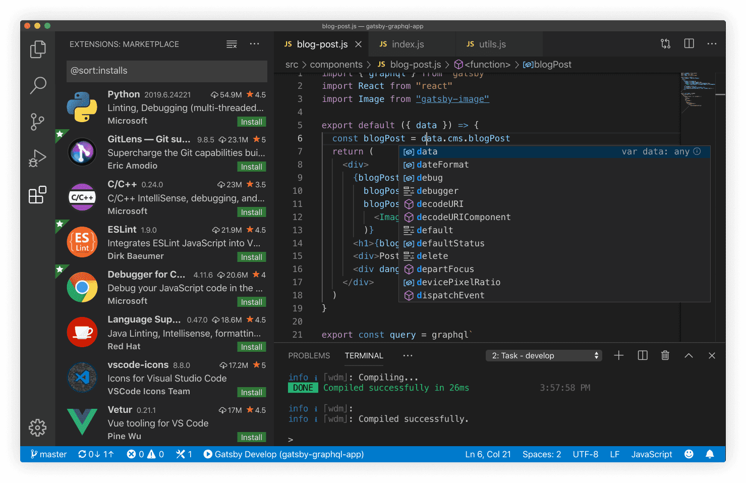
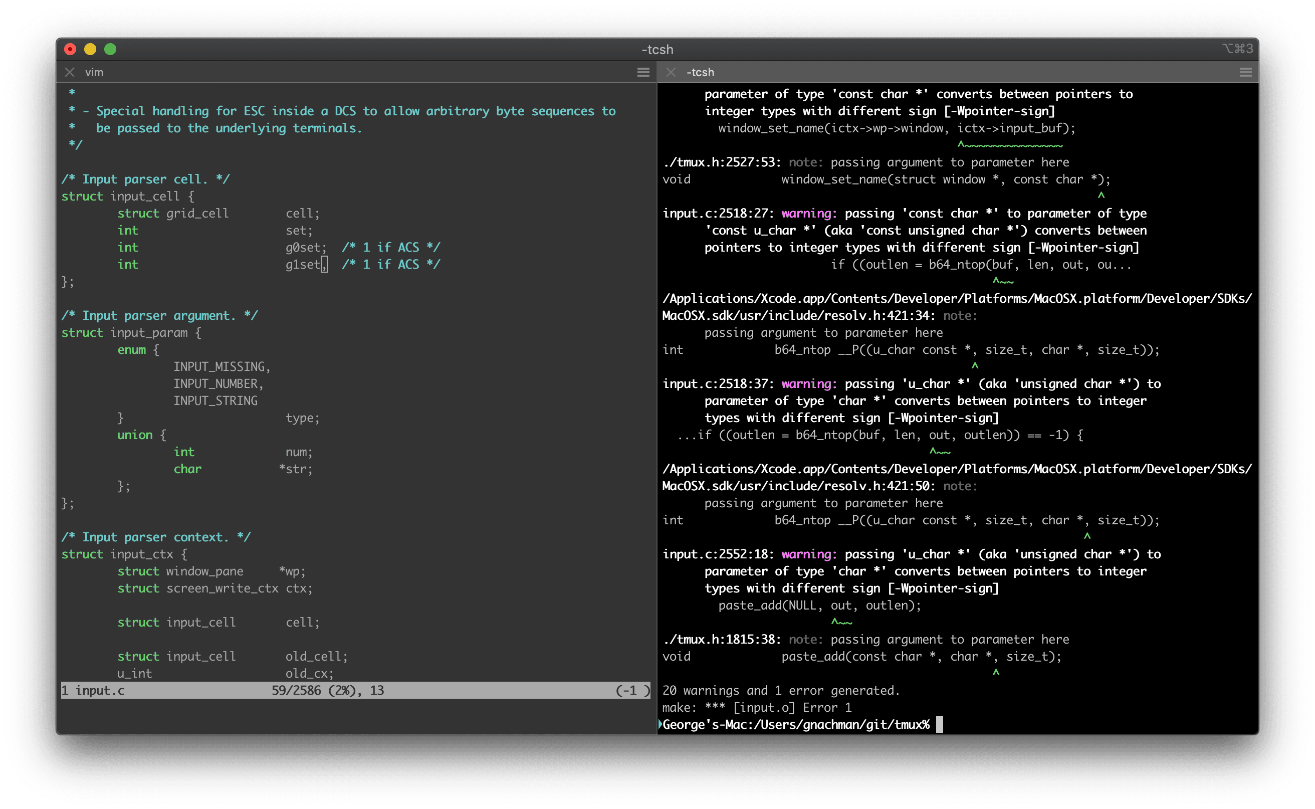
Here are default screenshots from VS code and iTerm illustrating this.
VS Code
Terminal
It's no surprise that as developers, we enjoy dark mode and if you look at all the cool companies building tools for developers, they understand this.
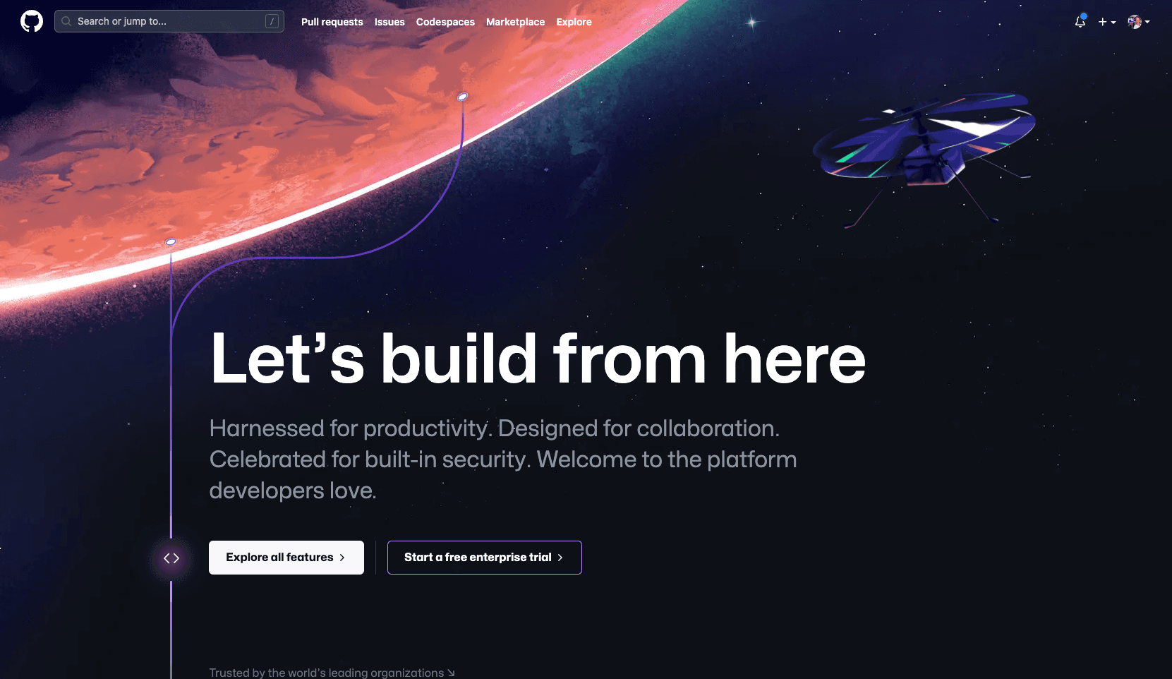
Here are a few examples:
GitHub
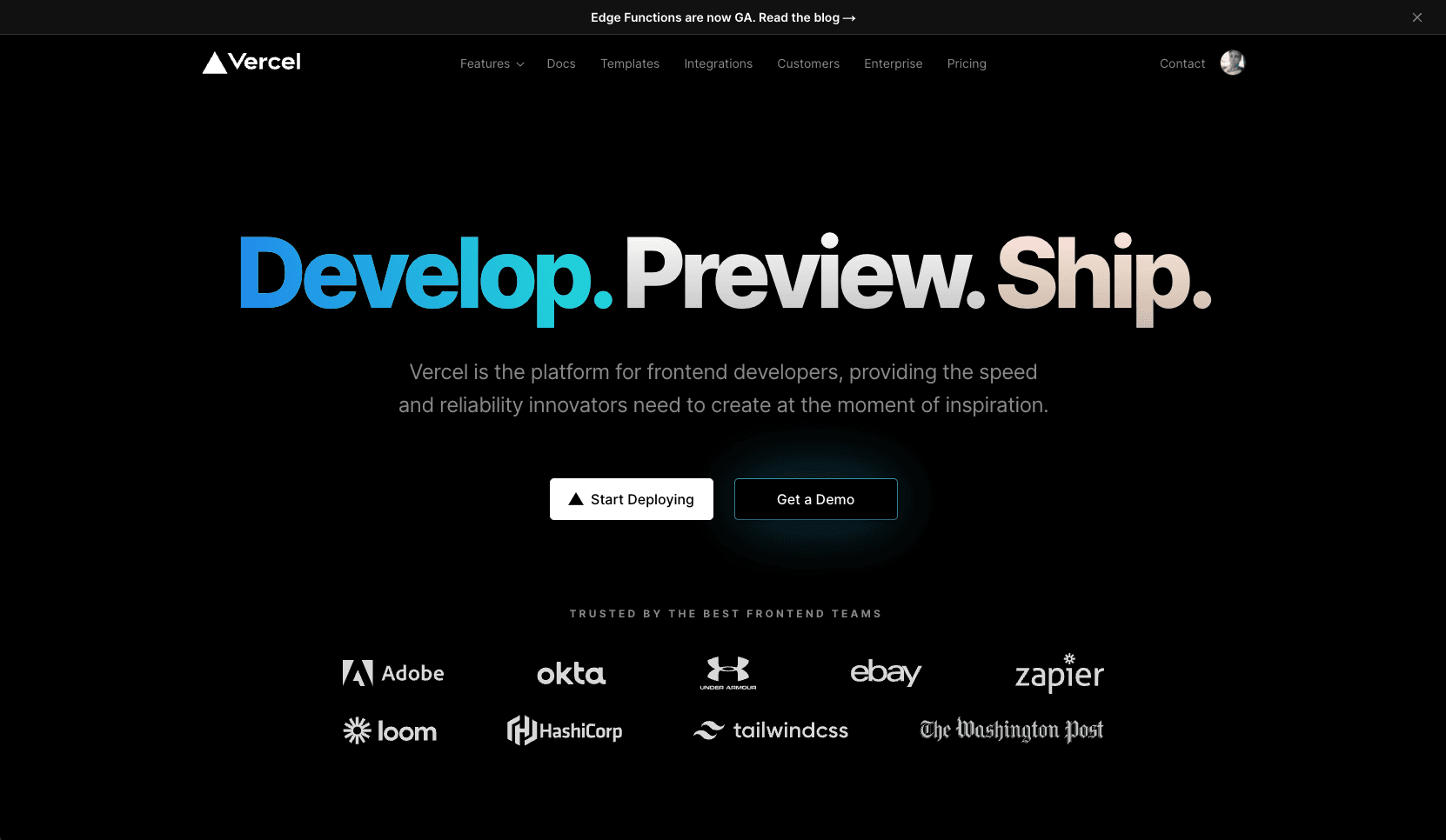
Vercel
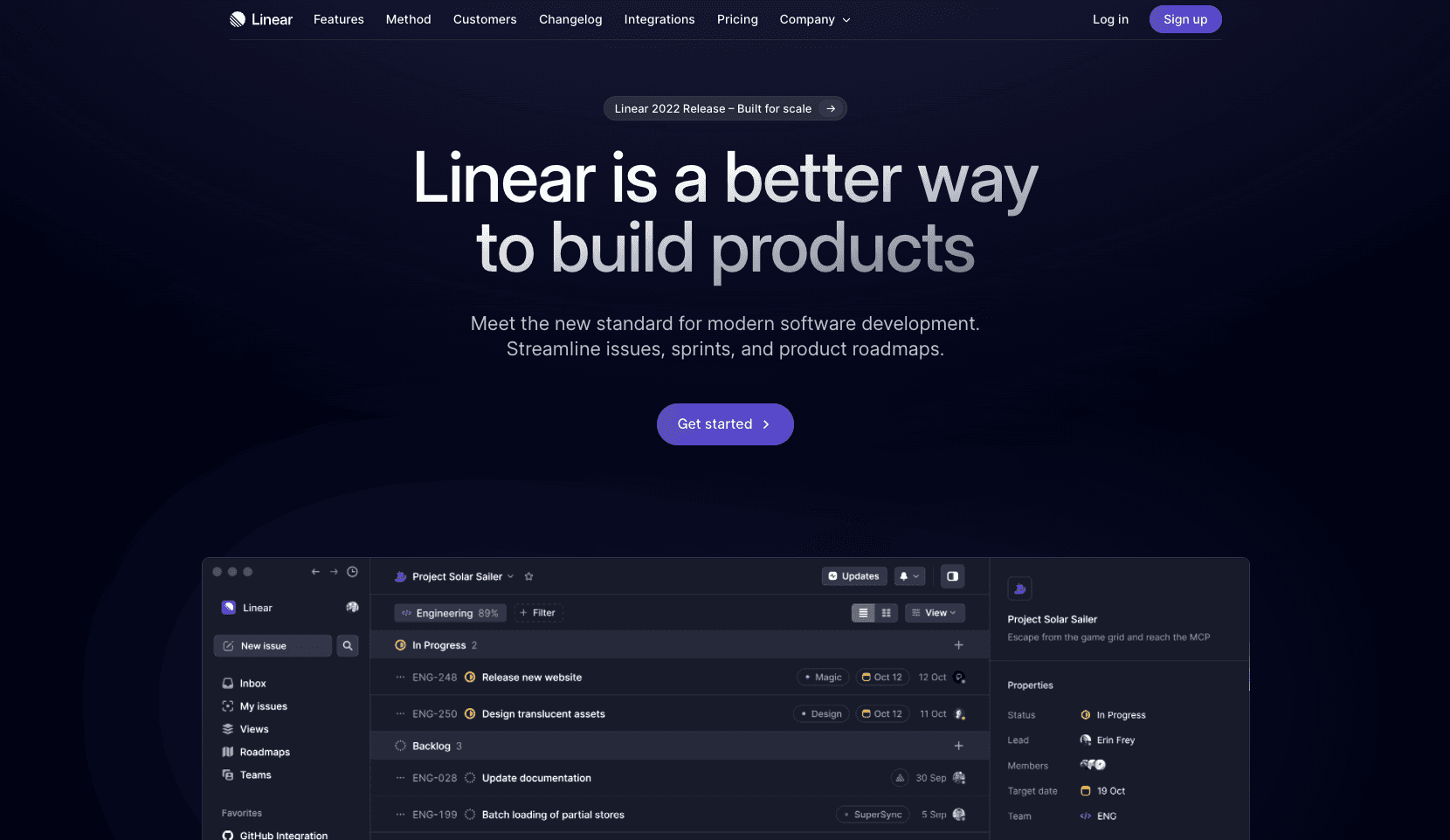
Linear
This made us think.
We're a cool company.
We're building tools for developers.
Why was our website so light?
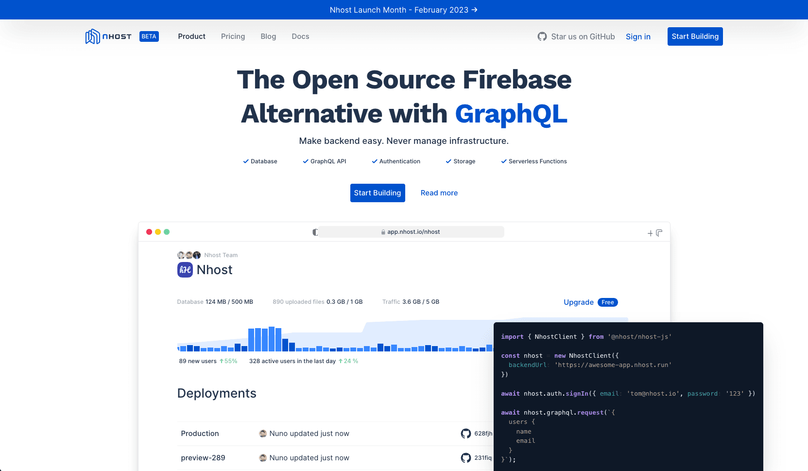
The reason our website looked like this was simple. We are competing with some of the largest corporations and well-funded startups in the world. With a team of only ten people, we decided to stay focused on our core product, which meant our website was neglected.
But us neglecting our website changes today.
In this post, I'll take you through the process of us designing and building this website and like many interesting things in life, it started with a Twitter DM:
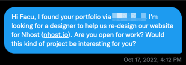
Facu agreed to take on the challenge and collaborate with us on our new website design. And we went to work right away.
Design Process
For the design process, we had 3 phases:
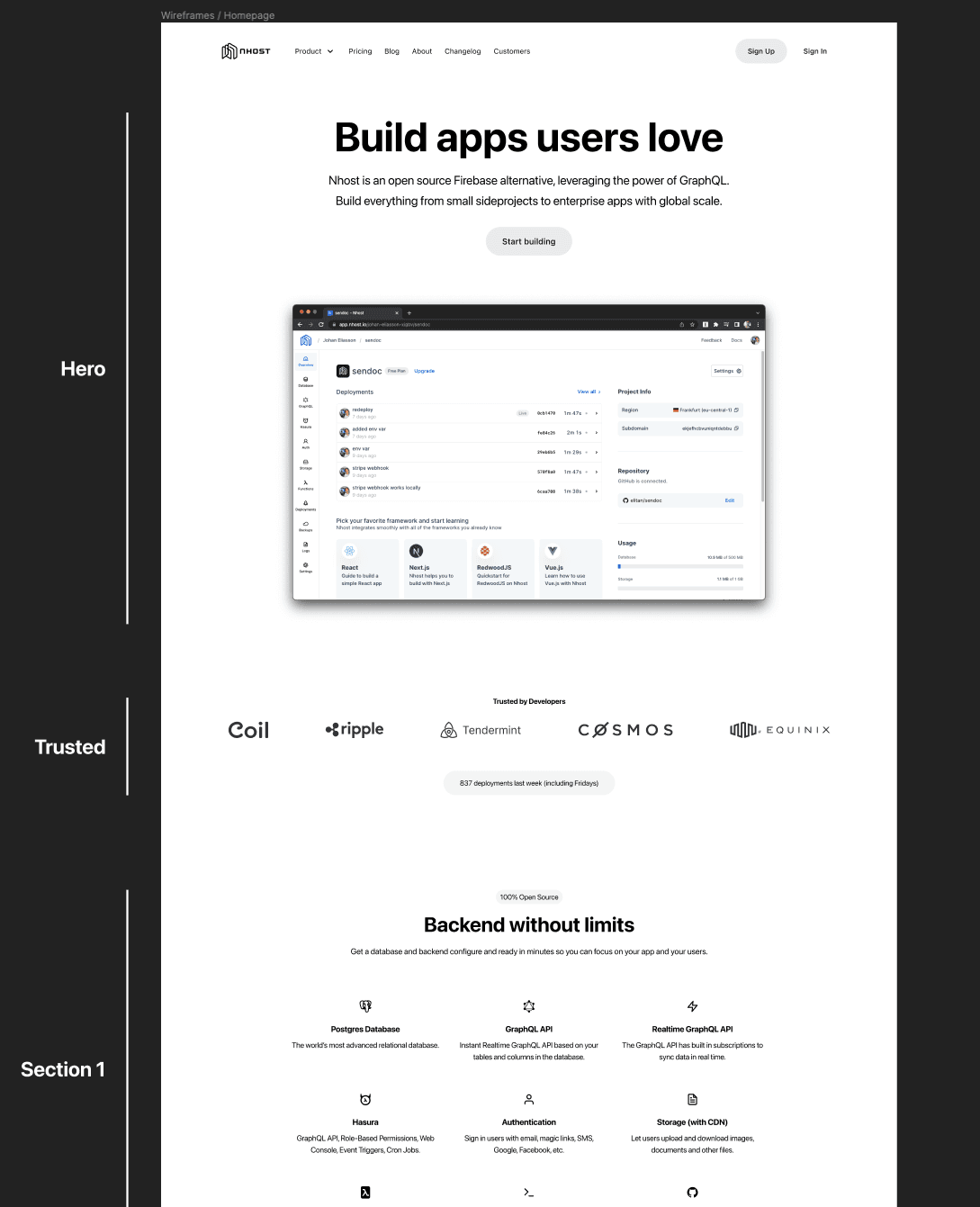
Phase 1: Wireframe
In the wireframe phase, we went through the home page. The home page was the most important part of our website and it would contain the most components of all pages. Getting the home page right was crucial as it would set the tone for all other pages of our new website.
Phase 2: Exploration
Once we completed the wireframe, we moved to the exploration phase. The purpose of the exploration phase is to find the style, brand, color direction.
Our vision was clear — dark mode with a touch of gradient elements. Personally, I think most dark mode websites are not dark enough. I wanted really dark. Like #000000 dark. But, part of the exploration phase is also to explore other design directions.
So we did four design proposals. Ranging from only black and white, to dark blue and white.
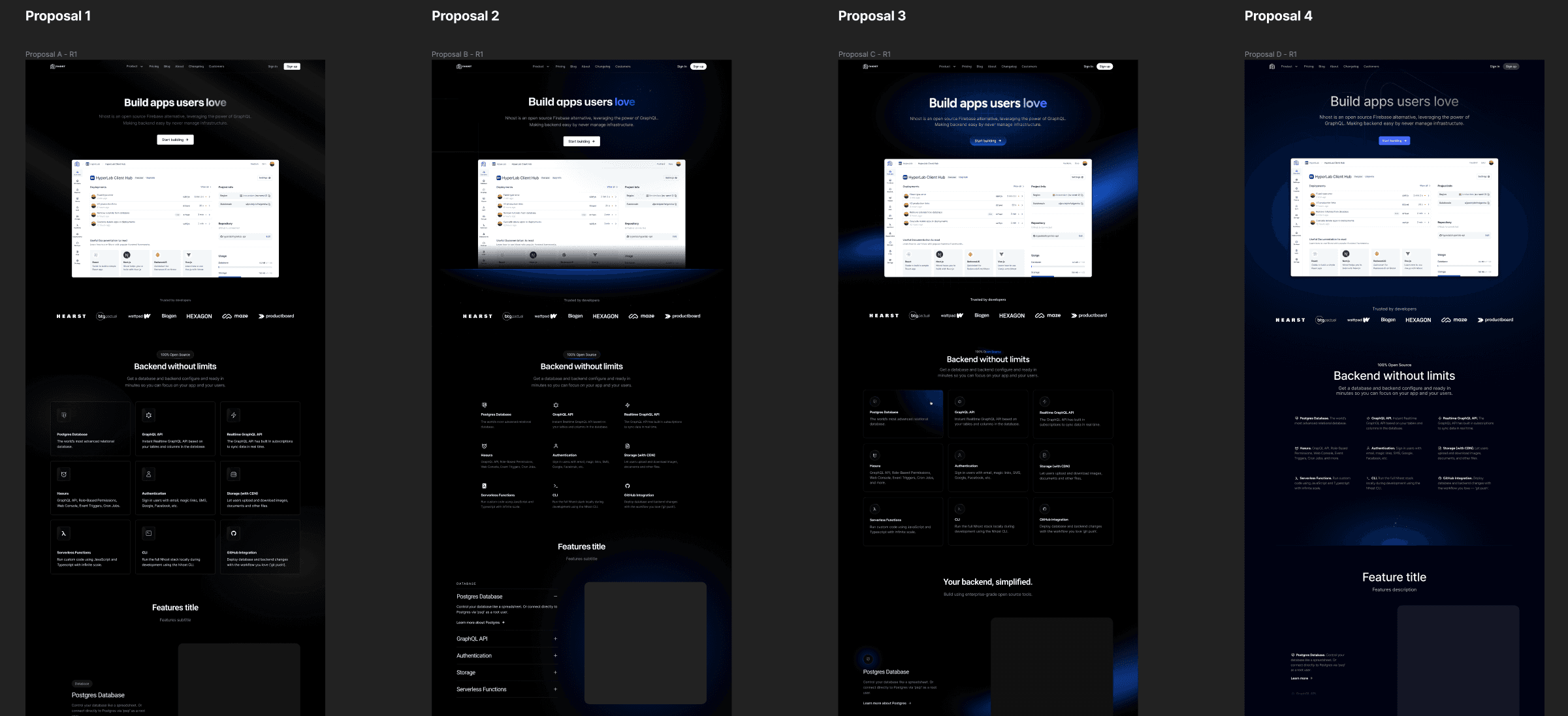
This is how we reasoned around the four proposals when discussing them:
- Proposal 1 was too anonymous. Only using black, gray, and white didn't give the design any personality.
- Proposal 2 was very close to what we had in mind.
- Proposal 3 had too many blue colors. We wanted the blue color to be more subtle.
- Proposal 4 wasn't dark enough.
You'll also notice that not only do the four proposals have different colors but there is also a design variation for each section. For example, the way we present the main features of Nhost in boxes under the Hero section varies among all designs.
This allowed us to do two things:
- Decide on a color palette and design style.
- Decide what design for each section we wanted.
At the end of the exploration phase, we chose Proposal #2 for its color and brand direction. However, we incorporated sections from the other proposals into Proposal #2.
Before we move on to phase 3, it became apparent during the exploration phase that the light-mode dashboard didn't look good on the new website. To ensure the website would look excellent, dark mode had to be implemented for the dashboard. You can read more about how we built dark mode for our dashboard in [link to the previous launch].
Phase 3: Delivery
Kicking off the third and last phase, the delivery phase, we knew what colors, styles, and overall designs we wanted to use. Now it was time to nail all sections with that overall design for our home page.
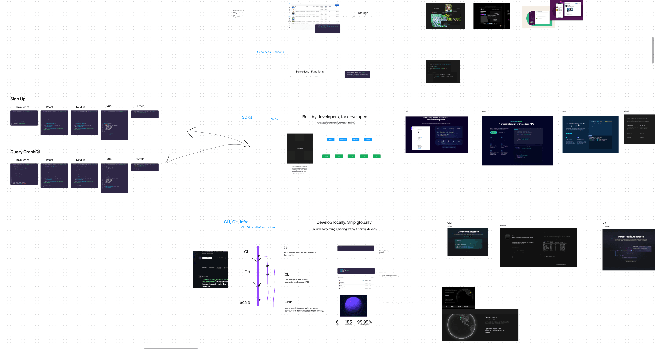
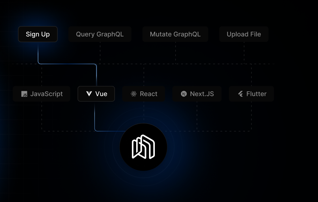
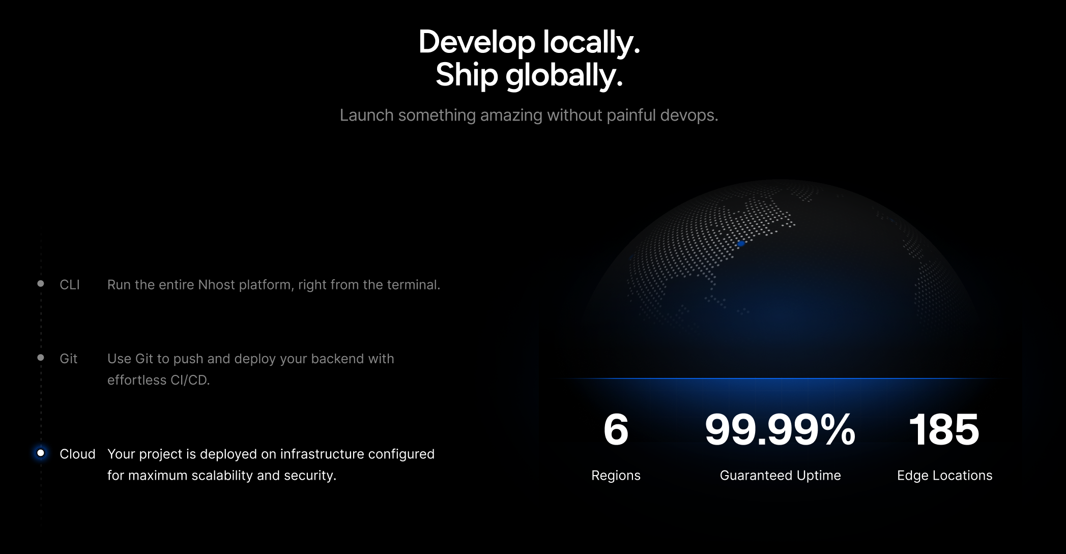
We used Figjam to communicate how we wanted each section on the landing page to look and work. Here's an example of the SDKs and CLI, Git, and Cloud sections:
Once we had the home page completed, we could use that as a reference when designing all other pages.
Most of the pages were straightforward. Pricing, Customers, Blog, and Changelog didn't need a lot of iterations. Instead, most of the time here was spent on the product pages (Database, GraphQL, Auth, Storage, Functions) which are like mini-landing pages. After a few more iterations back and forth we had our website completed.
At this point, the whole team was hyped. We could see the result and it was looking stunning!
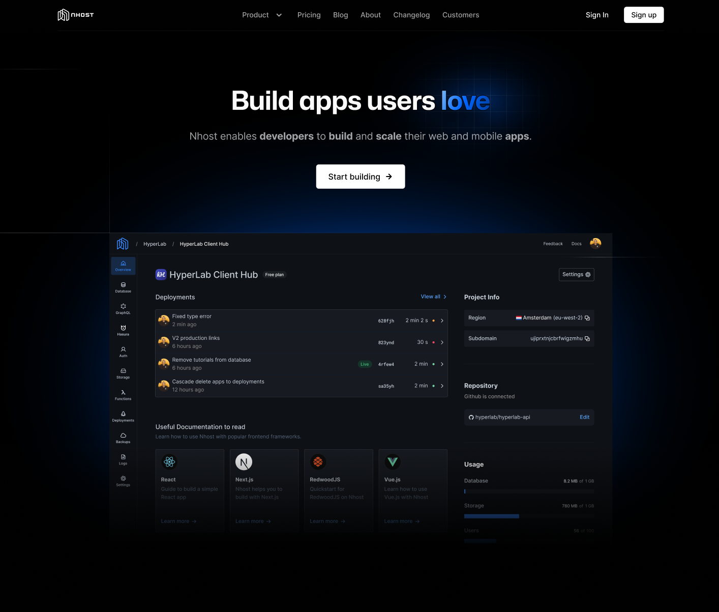
The design was ready. It was time for implementation!
Implementation
The implementation phase was hectic. We were short on time and we had a deadline to meet. We decided to deliver the website in two phases. The first phase would be without all the complex animations and the second phase would be with all the animations. This is a common strategy we use at Nhost. Fixed deadline, variable scope.
Tools
We used the following tools to build the website:
- Next.js for the frontend.
- Tailwind CSS for the styling.
- TypeScript for the type safety.
- MDX for the blog and other text-content page.
- Vercel for frontend hosting.
We plan to make the website open source in our Nhost Monorepo on GitHub, so stay tuned for that!
As for the actual result, you're looking at it now! We're very happy with the result and we hope you like it too.
Share this post