Dark Mode
1 February 2023


You can put away your sunglasses, because today we are bringing Dark Mode to the Nhost Dashboard.
Background
We were never really satisfied with having only the light mode, it was always our goal to create a dark mode variant as soon as possible. Switching between a dark mode IDE and a light application is not comfortable for the eyes. 😵💫
As a result of a thorough exploration phase and some Figma magic, we came up with a version that we all like. Unfortunately, updating the Nhost Dashboard to this version was not as simple as changing a few variables here and there. We had to improve the vast majority of our components under the hood to create a consistent experience.
Design Process
At Nhost, our aim is to empower developers and businesses of all sizes to easily and efficiently build and scale their digital products, and we believe that this includes providing an inclusive user experience. One aspect of this is offering a dark mode option to our users. In this blog post, we'll walk you through our design process for creating the dark mode experience for the Nhost Dashboard.
1. Contrast Ratio Measurement
One of the most important considerations when designing the dark mode is ensuring sufficient color contrast for readability. We followed the recommended contrast ratios for text and background colors as defined in the Web Content Accessibility Guidelines (WCAG). Another important point is saturated colors. Some of the colors in our light mode library did not work with dark mode, so we had to develop a new color palette without losing Nhost's brand identity.
As you can see in the image below, the new palette increased the contrast and made our Dashboard more accessible.
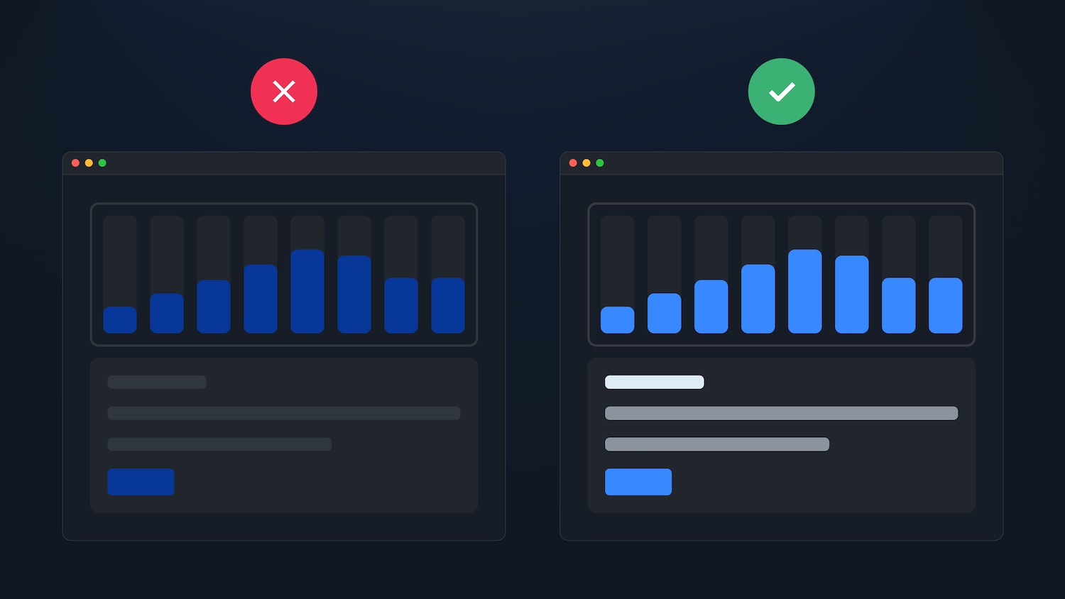 Bad contrast ratio vs. Good contrast ratio
2. Creating a Visual Hierarchy
Shadows are an effective way to create visual hierarchy in light themes, as they add a sense of dimension. However, this is not the case in dark mode.
To create a visual hierarchy of elements on the screen, we applied brighter colors to the content layers.
By elevating an element closer to an implied light source, you can create a sense of depth. The higher the elevation, the brighter the surface appears.
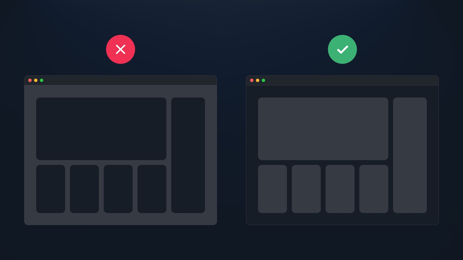 The surface closer to the light source is brighter
3. Letting You Choose
To accommodate different user preferences, we wanted to give our users the ability to switch between Dark, Light, and System modes.
This extra level of customization helps ensure that Nhost is accessible and usable for all users.
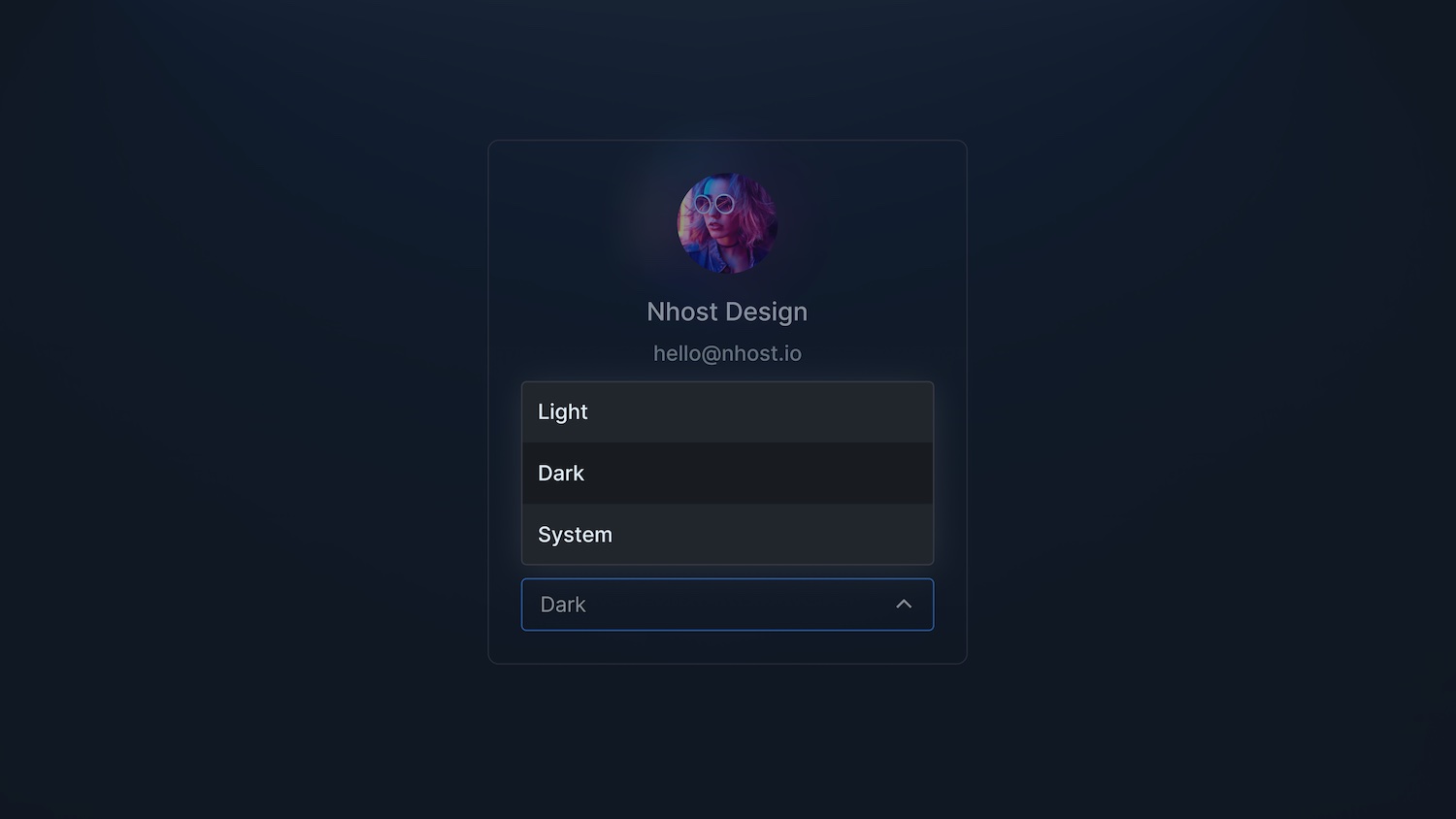 A theme selector with three options: Light, Dark, and System
In summary, the development of the dark mode for Nhost was a collaborative effort between our design and development teams. By balancing aesthetics and accessibility, we were able to create a user-friendly and visually appealing dark mode that meets the needs of all our users.
Technical Challenges
Aside from the challenge of doing the UI and design work in parallel, we had to make ensure that all of our components used the same color palette.
We started a component migration last summer when we decided to move to Material UI. Unfortunately, this migration was not quite complete at the time and we were still using some of the old components. This turned out to be a problem because not all components used the same styles.
It was not enough to create the new palette for the dark mode. We also needed to complete the migration of the components, as this was a solution to our longstanding problem of using different colors for the same purpose.
Let's see an example:
_10<div className="border border-gray-200">_10 <div className="border-greyscaleGrey border">Content</div>_10</div>
border-gray-200 and border-greyscaleGrey (a custom color) were only slightly different, and we could have just used the former everywhere, so we felt this was an inconsistency we needed to fix. Especially since different colors are used in dark mode and light mode. The fewer colors we have to manage, the easier it will be to adjust them in the future.
We have applied this logic to our components so that every time we want to define a border for them, we get the right colors for dark mode and light mode:
_21// darkPalette.ts_21const darkPalette = {_21 divider: '#21262d'_21}_21_21// darkPalette.ts_21const lightPalette = {_21 divider: '#eaedf0'_21}_21_21// Box.tsx_21const Box = styled(MaterialBox)`_21 border-color: divider;_21`_21_21// Component.tsx_21<Box className="border">_21 <Box className="border">_21 Content_21 </Box>_21</Box>
Finally, we have fewer things to worry about, and it's easier to understand and maintain our code. As a positive side effect, we have not only standardized the palette, but also improved UX in all areas. By using our modern component library, we are able to use the same hover effects, spacing and colors everywhere for components with a similar purpose.
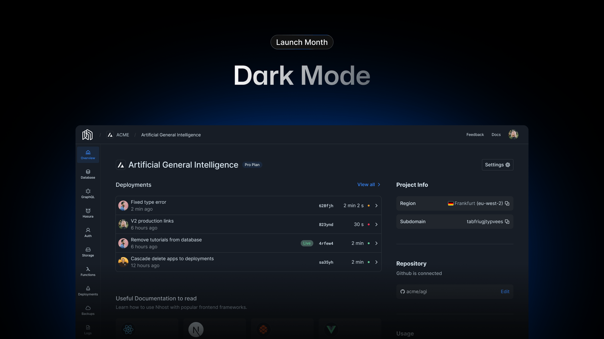
Showcase
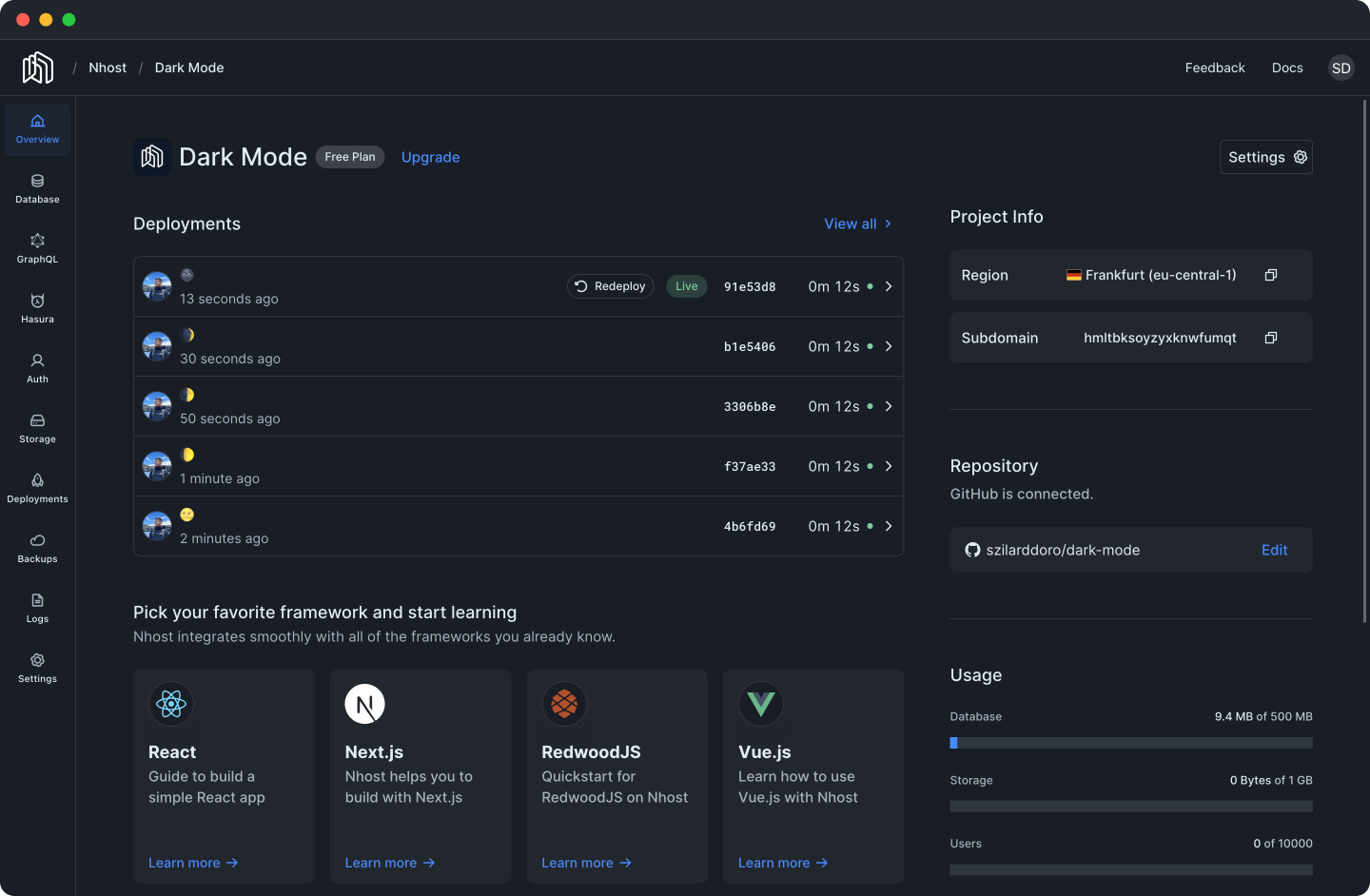 Overview section of the Nhost Dashboard
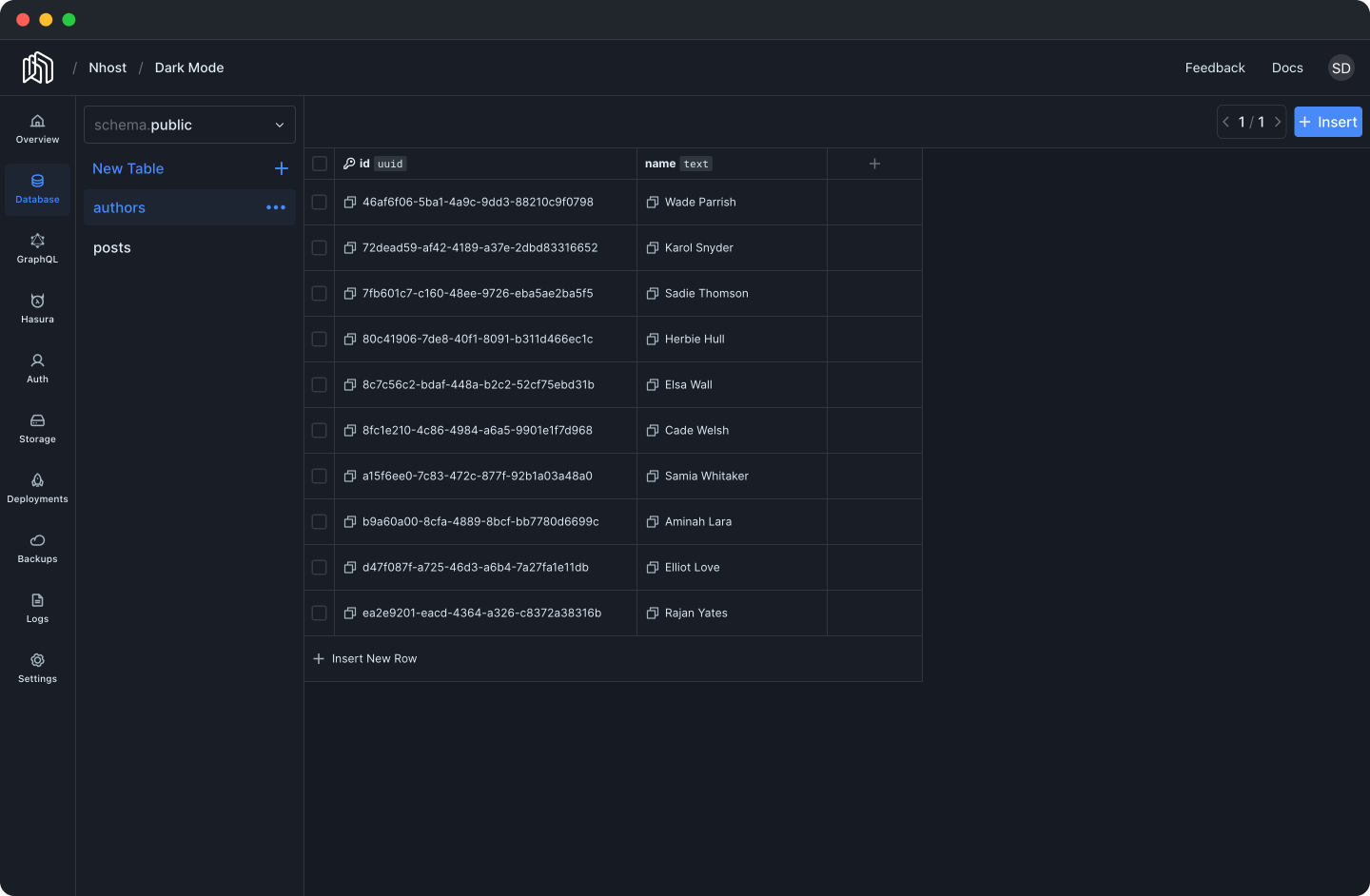 Database section of the Nhost Dashboard
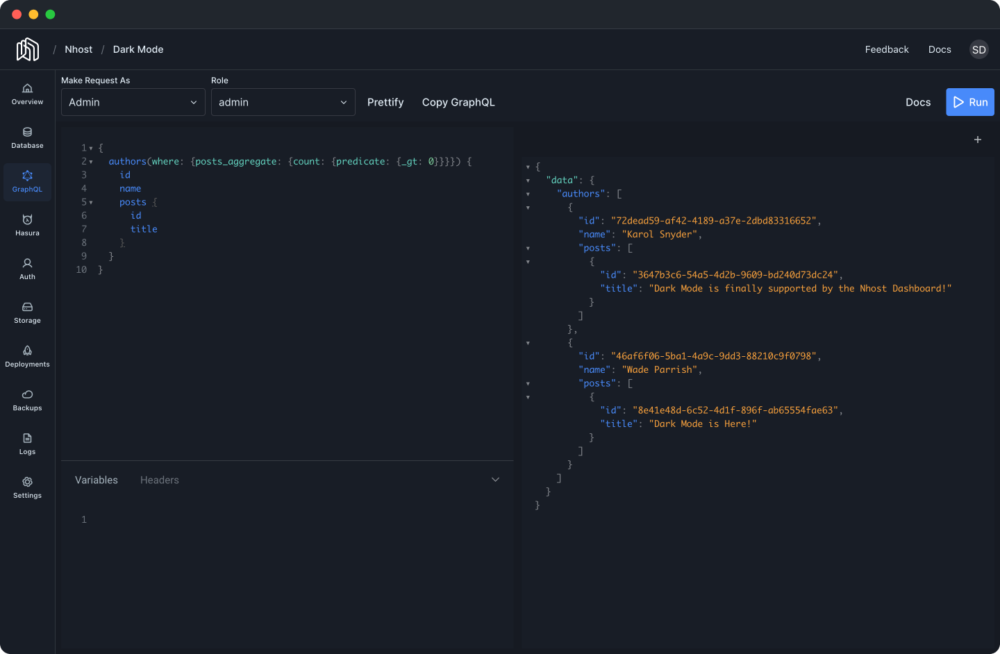 GraphQL section of the Nhost Dashboard
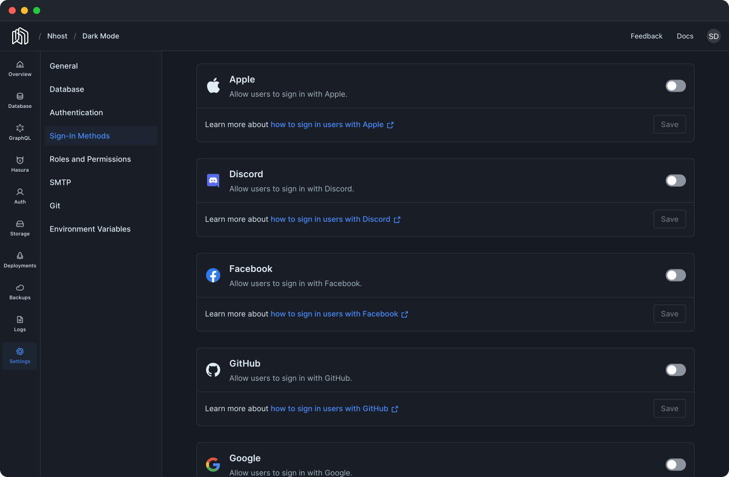 Settings section of the Nhost Dashboard
Conclusion
Despite the difficulties we had in finding the right colors and contrast ratios, we are proud of the final result and believe that you will like the dark mode feature we implemented.
We hope you'll stick with us during the launch month, because the Nhost Dashboard is not the only thing going dark. We have some exciting news coming next week!
P.S.: If you like what we are doing, support our work by giving us a ⭐ on GitHub.
Share this post